

‘In Cold Blood’ Redesign
Typography Project
This book cover redesign was for Truman Capote’s most well known work, ‘In Cold Blood’. My goal for this project was to focus on the type as the eye-catching factor rather than an entirely separate image. I had several ideas for this cover, but after going through a few different versions and some critiques on this work, I chose to build on this concept.
Project Summary

This book cover had a lot more problem solving involved in it than I had realized, so I ended up making a few of the images you see on the cover (the footsteps, blood pool, blood splatter).
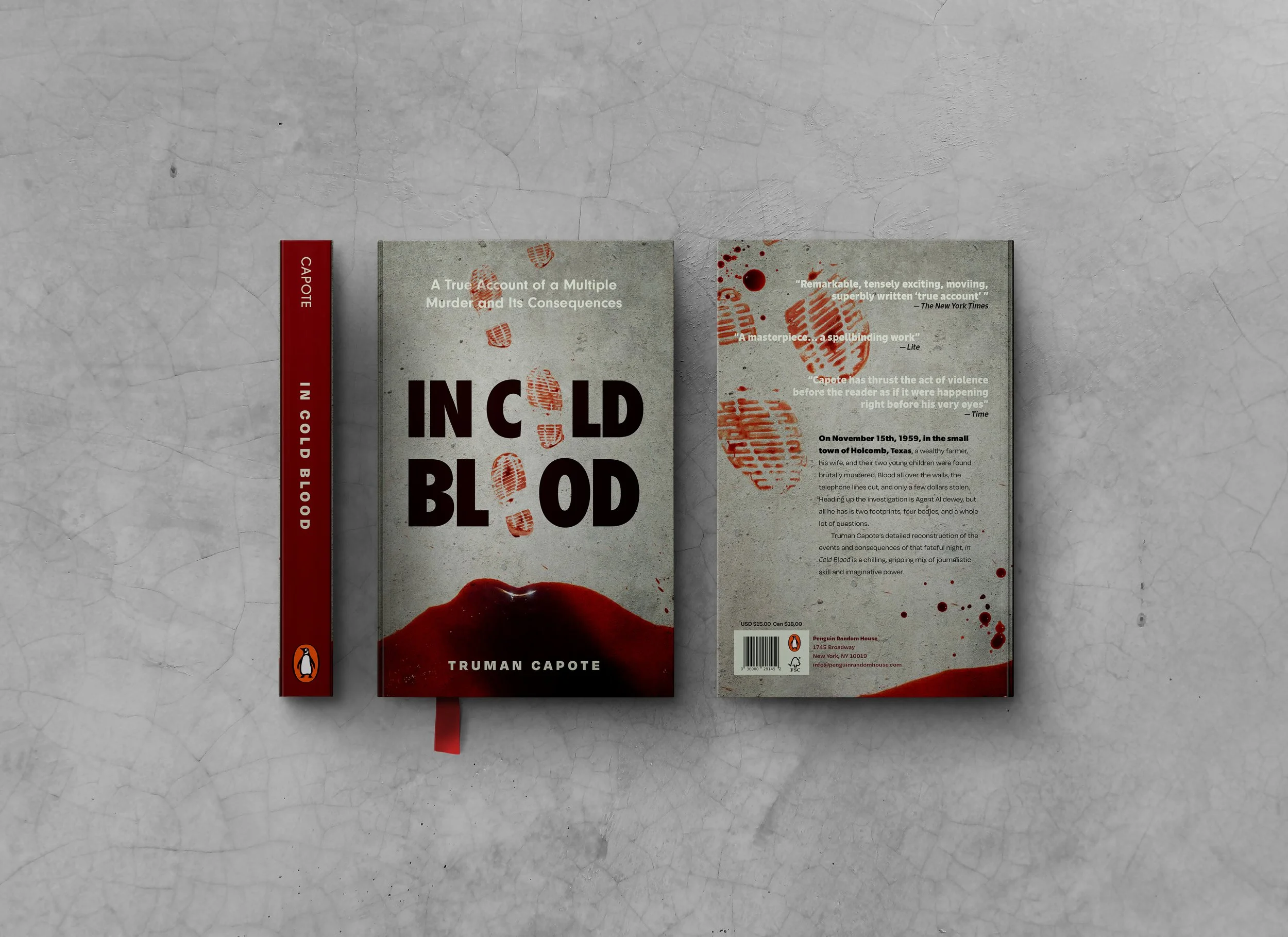
For some reason, when making this, I couldn’t find any good images of blood or footsteps that looked believable or matched what I envisioned. I actually bought fake blood from the Halloween store and poured it over paper to get the effect I wanted. For the footsteps, I made a large pool of fake blood on the floor and used a pair of old boots to dip in the blood, and then I ‘stamped’ it on paper until I was satisfied with the results. The images below are of my experimenting with fake blood as well as initial concept sketches.


